Skip to content

Iron Link Intel · annotated presentation

ECHO

This is the deck as presented, with what was said alongside each slide. The prototype screens run live in the presented version — here they are stills. Confidential engagement; every screen is rebuilt to the shipped spec on synthetic data.

01 / 30

Exhibit · Iron Link Intel

ECHO

A defense-grade OSINT threat platform, rebuilt around one diagnosis.

  • Lead Product Designer · Brand and Product
  • 2026
  • Confidential engagement · synthetic data

I'm Paul, lead designer on ECHO.

A defense intelligence platform handling 42 billion records.

Early-stage team, so I owned everything end-to-end: brand, product, research, and architecture.

Today's visuals are fully rebuilt on synthetic data for confidentiality.

The door you just used is the product.

Red means investigate. Rules are for humans, because the agent already has them.

I'll keep it to about 15 minutes. Feel free to interrupt with questions as we go.
02 / 30

The diagnosis

The data was never missing. The analyst was doing the reading.

Forty-two billion records indexed across two hundred sources. A full identity correlation on a hard target still took three days.

The core problem: 42 billion records across 200 sources.

Yet an analyst still spent three days answering a single query.

The data wasn't missing.

The human was acting as the manual processing engine.

My design challenge: shift that cognitive load out of the user's head and into the platform architecture.

03 / 30

Scope

Founder plus ten. One designer.

  • What I owned

    • Brand: the Architecture of Certainty identity
    • Product: seven operator surfaces
    • The design system and its enforcement
  • Hands on

    • Ran the heuristic audit myself
    • Wrote the identity
    • Designed and specced the terminal
  • Provenance

    • Confidential engagement
    • Every screen rebuilt to shipped spec
    • Synthetic data throughout

Quick context on scope.

Founder plus ten, and I was the only designer. So brand and product both.

I ran the research. I did the heuristic audit myself.

I designed the operator screens and the system underneath them.

It's confidential work, so everything you're about to see is rebuilt to the shipped spec on synthetic data.

Nothing here is a real investigation.

04 / 30

01


The problem

Three days, four tools, one answer.

Three days. Four tools. One answer. That's where I started.

05 / 30

The problem

·

This is the old Overview.

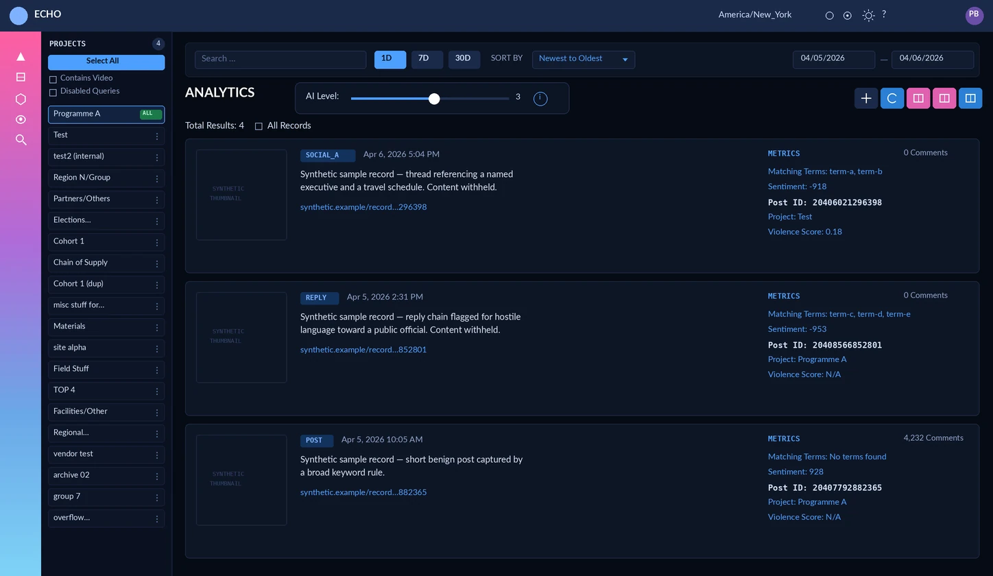
The audited pre-redesign overview: unlabeled icon rail, project chip wall, and equal-weight analytics cards with raw sentiment and violence scores.Overview
Audited originals, redrawn on synthetic content. Real operator screens stay confidential. Unlabeled icons, and a wall of equal-weight cards.

This is the old Overview.

Unlabeled icons. A wall of equal-weight cards dumping raw scores.

Redrawn on synthetic data so I can show it. The live screens stay confidential.

06 / 30

The problem

·

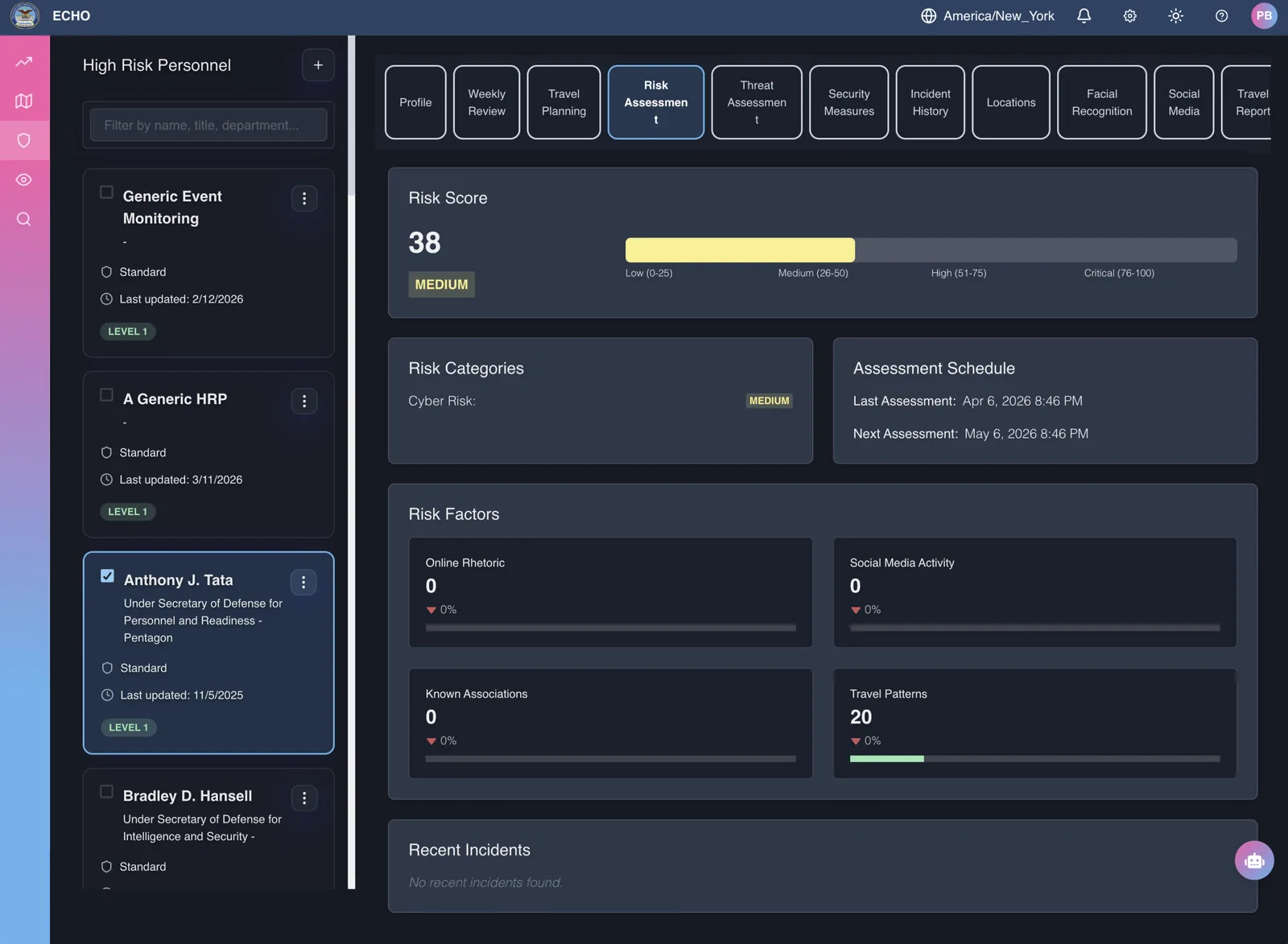
This is the old Personnel screen.

Pre-redesign high-risk personnel risk assessment: eleven equal tabs with broken wrapping, a medium score of 38, and empty risk-factor cards.Personnel
Eleven equal tabs, a score of 38, empty risk factors. Same costume, next surface.

This is the old Personnel screen.

Eleven equal tabs. Score thirty-eight. Empty risk factors.

07 / 30

The problem

·

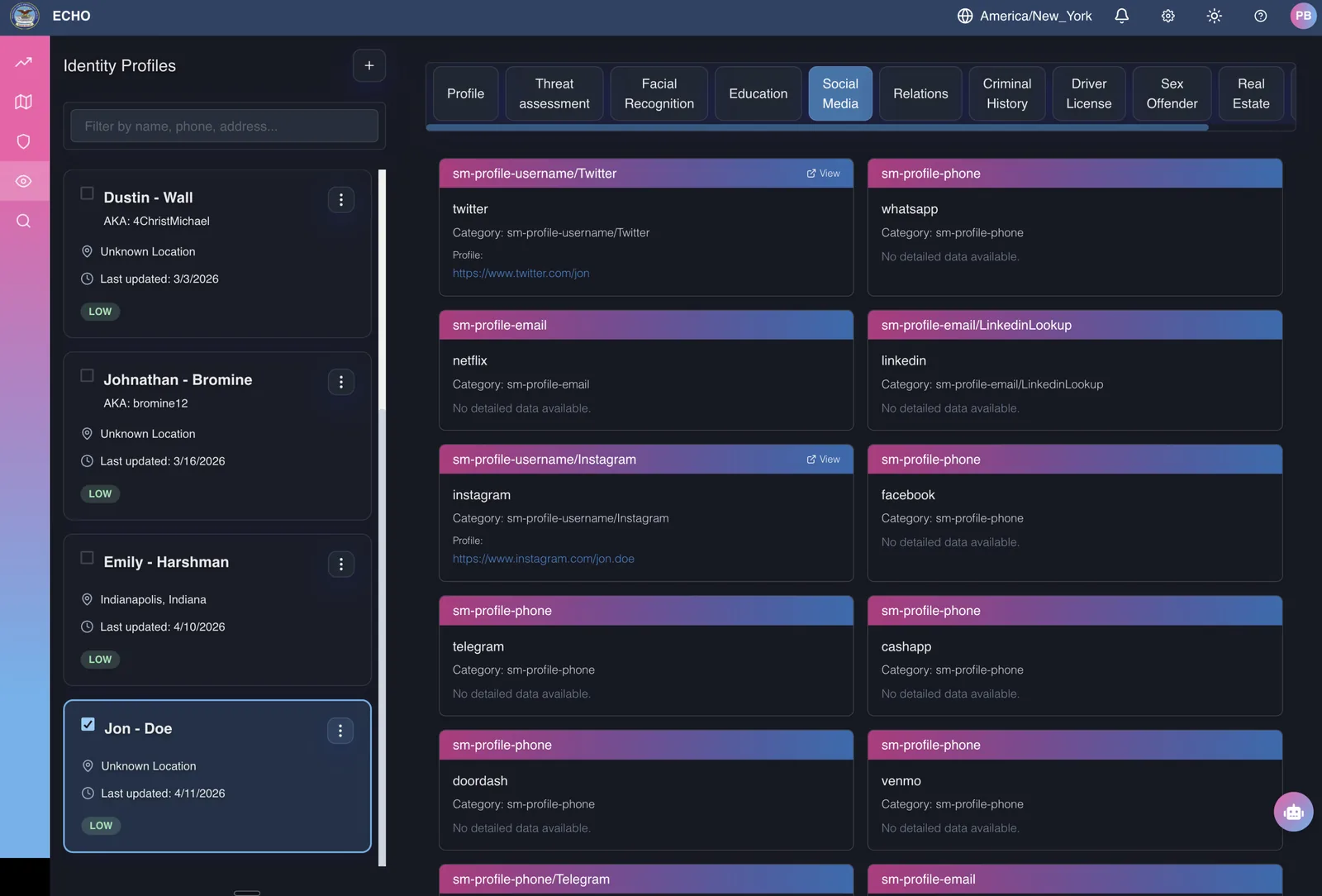
This is the old Identity screen.

Pre-redesign identity social-media tab: ten equal tabs and a grid of cards with internal slug titles and many empty data states.Identity
Ten tabs, slug titles, a card dump. Seven surfaces failed this way. Average 47. The rebuild was the job.

This is the old Identity screen.

Ten tabs. Slug titles. A card dump.

Seven surfaces failed this way. Average forty-seven. Redesigning it was the job.

08 / 30

Why it matters

Cost of failure is measured in lives, not service-level agreements.

Alex Mercer, my composite research persona, is judged on producing work that holds up in a brief, a court, or under a colleague’s scrutiny. Finding something is not enough.

One thing about the stakes, because it changes what good means here.

The cost of a miss isn't a service-level agreement. It's a life.

And Alex, my composite research persona, isn't judged on finding something.

He's judged on whether what he found holds up.

In a brief. In a court. Under a colleague's scrutiny.

09 / 30

02


The mechanism

Seven surfaces, scored against one question.

I evaluated all 7 operator surfaces against one question.

Does this highlight the signal, or just add noise?

10 / 30

The wrong starting point

I went deep on competitive analysis and brand persona first.

Good work. It told me nothing about why an analyst could not read the screen. What cracked it was duller and smaller: I went and scored the thing.

I actually started wrong.

Wasted time on high-level market positioning.

What actually cracked the case was dull, tactical work.

A strict Nielsen audit across every surface, to pinpoint where the interface was failing.

11 / 30

The method

Audit the product the way an analyst audits a source.

Is this signal strong, reproducible, and defensible? A Nielsen evaluation across all seven operator surfaces, each scored on one question: does this make the signal readable, or does it add noise?

My method: audit a product the way an analyst audits a source.

Is this signal strong? Is it reproducible? Is it defensible?

So I ran a Nielsen heuristic evaluation across all seven operator surfaces.

Each one scored against a single question.

Does this make the consequential signal legible, or does it add noise?

One question, seven surfaces, so the scores are comparable.

That's what made the next slide useful.

12 / 30

The baseline

47out of 100.Elevated

  • Overview & trendsA wall of widgets with no focal point40Elevated
  • Dashboard navigationTwelve unlabeled icon tabs: recall, not recognition55Elevated
  • AnalyticsCharts that show a spike and dead-end35Elevated
  • High-risk personnelTable fatigue under time pressure42Elevated
  • Identity profilesA separate screen per data category45Elevated
  • RFI managementRequests disappear between stages50Elevated
  • Settings & detailsA flat wall of ungrouped toggles65Elevated

Audited before, re-scored after the rebuild. Same method, same seven surfaces. Internal Echo audit.

The audit came back at 47 out of 100.

Dead-end charts. Unlabeled navigation forcing memory recall.

Request states vanishing between stages.

Different screens, identical root issue.

The interface was forcing the human to do the system's job.

13 / 30

03


Insight · Monochrome

The fastest way to make one thing loud is to make everything else quiet.

Insight. Monochrome.

The fastest way to make one thing loud is to make everything else quiet.

14 / 30

At rest

·

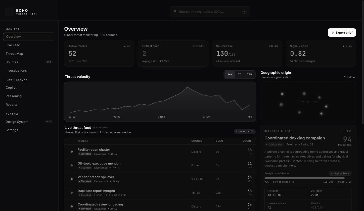
Monochrome at rest.

ECHO overview at rest: the entire dashboard rendered in grayscale with no colour anywhere.At rest
Nothing here has earned attention yet.

My favorite design choice: the interface sits completely grayscale at rest.

Nothing here has earned attention yet.

Colour is reserved for meaning. Not decoration.

15 / 30

04


Class in Session

Teaching agents UI through color syntax and structure.

Teaching agents UI via color syntax and structure.

16 / 30

Colour arrives

Colour is a signal.

ECHO overview at rest: the entire dashboard rendered in grayscale with no colour anywhere.At rest
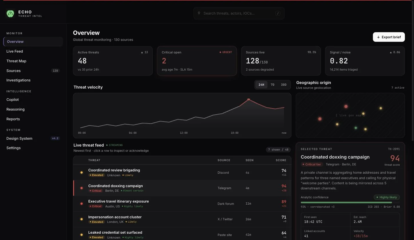
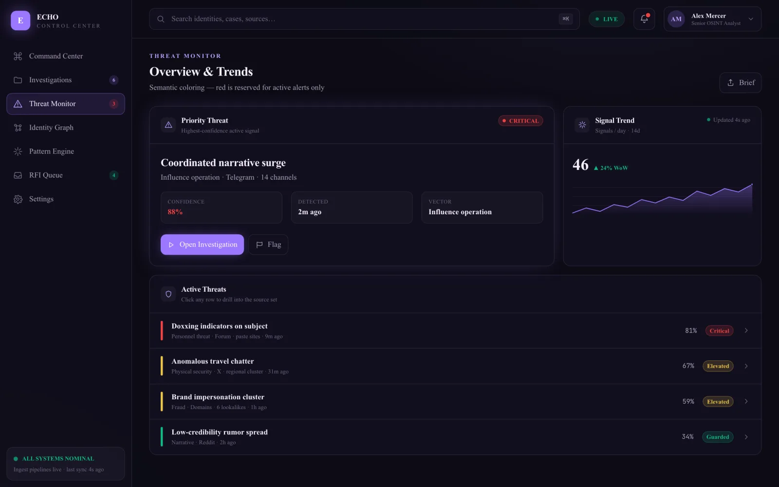
The same ECHO overview holding a critical alert, with red tier badges and a critical rail.Critical tier arrives

Same layout and components. Tokens fire when meaning arrives.

Red means alert. From here I page the packet to the table.

Same layout. Same components.

When a threat breaches a threshold, targeted colour activates.

Red signals an actionable alert. It never decorates.

Same red as Continue on the door.

From speaker: Raise, then Page. Phones Activate — or Seat. Resolved clears.

17 / 30

Four transfers

Name what the interface makes them do, then move it.

  • Threat trend gets 2x the grid

    • Bento grid gives the threat trend 2× the area
    • Hue reserved for tier
    • Red means alert
  • Sidebar says the name

    • Sidebar defaults to icon plus label
    • Status badges push activity into the nav
    • Master-detail pins the subject
  • Every chart drills

    • No chart is a terminus
    • Triage stack with tier badges
    • Pinned rows hold position regardless of sort
  • Pipeline stays on screen

    • Visible pipeline with stage and ownership
    • SLA countdown that changes state near a deadline
    • Settings grouped and searchable

Every surface got the same treatment.

Name what the interface is making the analyst do. Then move it.

Threat trend gets 2x the grid: twice the area, and hue is rationed to tier.

Sidebar says the name: labels come back, and the case file stays pinned.

Every chart drills: no chart is a terminus. Every one drills through.

Pipeline stays on screen: stage, ownership, and an SLA countdown.

18 / 30

The handoff

The analyst commands. The swarm does the reading.

Correlation, collection, and the three-day grind went to agents. The human role is judgment: what to pursue, what to cite, and when to act.

The analyst commands. The swarm does the reading.

Correlation, collection, the three-day grind — handed to agents.

The human role became judgment: what to pursue, what to cite, when to act.

19 / 30

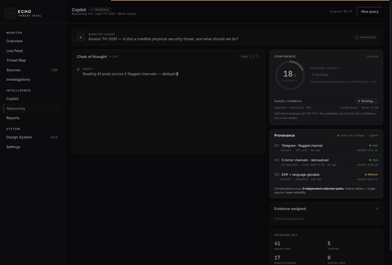
The AI design problem

Trust, not layout.

ECHO reasoning surface showing a live chain of thought, a forming confidence gauge, and a provenance panel with signed chain of custody.Reasoning & provenance

The chain of thought is visible as it forms. Confidence moves as evidence lands. Every claim carries its provenance. If you cannot trace it, you cannot cite it.

Once automation handles data correlation, UX becomes a problem of trust architecture.

An analyst's work must survive high-stakes scrutiny.

So I made the model's reasoning explicit, dynamic, and bound to a signed chain of custody.

Every single insight is traceable back to its source.

20 / 30

One instrument per question

The feed is for triage.

ECHO live feed: streaming intercepts in a dense triage list with tier badges, sources and scores.Live feed

Newest first, with tier badges, so you can scan it at speed. This surface is for deciding what deserves a look. Understanding happens elsewhere.

Quick word on the rest of the terminal.

This is really seven surfaces, and I've only shown you one.

The feed is built for triage. Newest first, tier on every row, scannable at speed.

It's for deciding what deserves a look. Not for understanding it.

21 / 30

One instrument per question

·

The map is a different instrument.

Drag it. Routing reads as distance here, which is a question a list cannot answer no matter how well it is sorted.

And the map is a genuinely different instrument.

Not the same data in a prettier wrapper.

Drag it. Routing reads as distance here.

That's a question a list cannot answer, no matter how well you sort it.

Which is the whole reason it earns its own surface.

22 / 30

1,028 → 0

hardcoded colour values converted to tokens across ten screens, and drift violations remaining under the enforcer

echo-lint reads the token directives out of the source and fails the build when a raw hex reappears. Cursor and Figma read the same contract file.

ECHO token migration · echo-lint drift compiler

To make this stick, I killed 1,000+ hardcoded colors.

Replaced them with tokens.

Then I wrote a build linter, so raw hex codes literally break the build.

It keeps the system tight.

And it gives AI coding agents a single source of truth.

23 / 30

The contract

Written once. Enforced on every build.

  1. 01DeclaredOnce, in Design.md and globals.css--art-echo-critical: …
  2. 02ConsumedThe same file Claude, Cursor and Figma readcolor: var(--art-echo-critical)
  3. 03Checkedvalidate-design-system.sh, on every buildrg '#[0-9a-f]{6}' src/
  4. 04RejectedA raw hex fails the build, including minecolor: … ✗ build failed

Stylesheet

  • var(--art-echo-critical)…
  • var(--art-echo-elevated)…
  • var(--art-echo-guarded)…
  • var(--art-echo-brand-fg)…
  • var(--art-echo-r0)…
  • var(--art-echo-r12)…

AI agents · Design.md

  • --art-echo-criticalCritical tier
  • --art-echo-elevatedElevated tier
  • --art-echo-guardedGuarded tier
  • --art-echo-brand-fgBrand · active and selected
  • --art-echo-r0App canvas
  • --art-echo-r12Text · level 1

Figma variables

  • echo/critical
  • echo/elevated
  • echo/guarded
  • echo/brand-fg
  • echo/r0
  • echo/r12

Under this contract: 13 neutrals · 3 tiers · 1 brand · 9 type sizes · 14 spacing steps

One token followed until it breaks the build. The same six resolve in every surface that reads the contract. Values are read live from this page’s own stylesheet.

My Design.md contract syncs directly with globals.css, Figma, and Cursor.

What you're seeing right now isn't static text.

It's reading live tokens from the stylesheet running this deck.

Same six tokens, three surfaces: the stylesheet, the AI agents, and Figma.

Tokens are how the design stays legible to the models. One source of truth.

24 / 30

The design language

Every token has one job.

Neutral base

Monochrome at rest. The whole board lives here until something matters.

  • --art-echo-r0…App canvas
  • --art-echo-r1…Sidebar
  • --art-echo-r4…Card, popover
  • --art-echo-r5…Wells, input fills
  • --art-echo-r6…Hover surface
  • --art-echo-r8…Strong divider

Text

Two decision-grade brightnesses. No third. A faint tier is the first thing to vanish when someone scans fast.

  • --art-echo-r12…Level 1 · 19.0:1 AAA
  • --art-echo-r10…Level 2 · 7.7:1 AAA
  • --art-echo-r11…Icon and nav chrome, not a third tier
  • --art-echo-r9…Dim meta · never body copy

Signal

Meaning only, never decoration, always paired with an icon or a label.

  • --art-echo-critical…Crimson · alert, and nothing else
  • --art-echo-elevated…Saffron · 11.5:1 AAA
  • --art-echo-guarded…Emerald · 5.9:1 AA

Brand

Active and selected only. It never competes with a signal.

  • --art-echo-brand…Iris · fills and rings, never text
  • --art-echo-brand-fg…Iris on dark · 8.9:1 AAA

Read live from the running stylesheet. Fifteen tokens, four jobs, and a linter that fails the build when a raw hex reappears.

This is the entire design token architecture.

Instead of organizing by raw color, I grouped tokens strictly by semantic role.

An achromatic baseline handles idle states, using just two text contrast levels.

Three dedicated signal colors communicate priority tiers.

Every value on this slide is rendering directly from the live stylesheet.

25 / 30

One system

·

390px to a wall display.

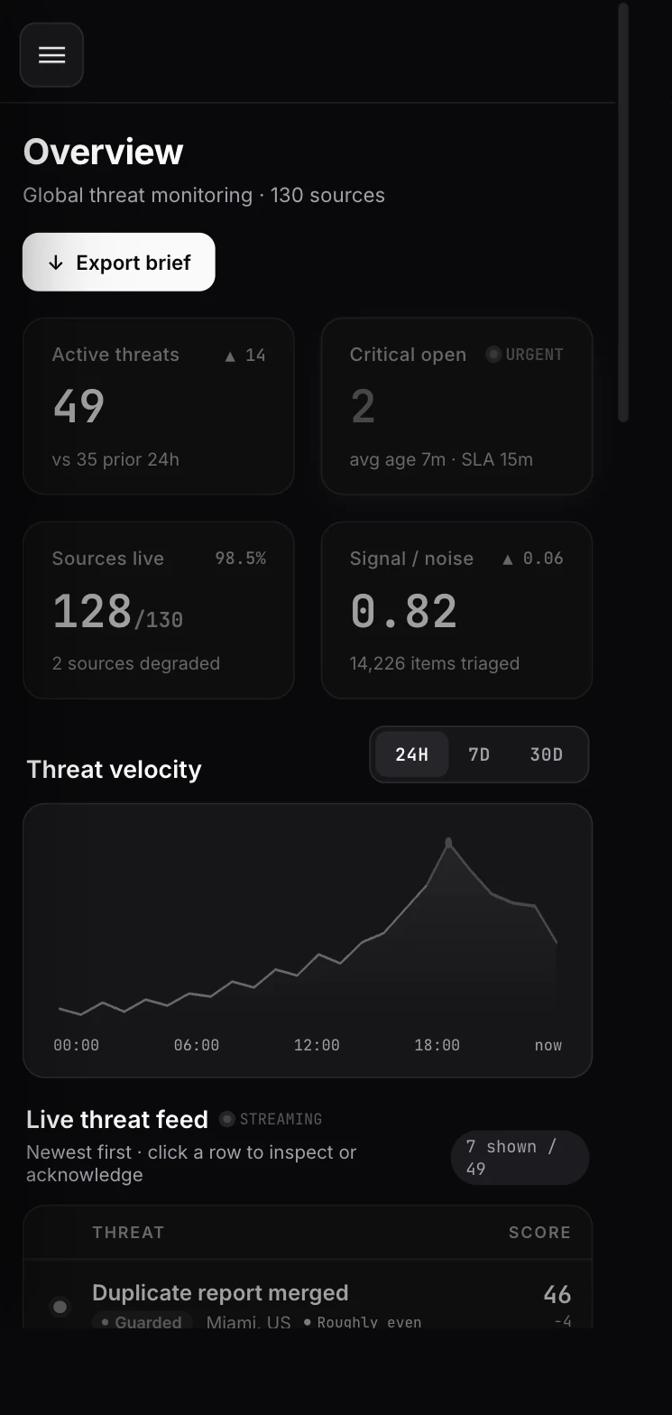
ECHO overview on a 390px phone: drawer navigation, two-up metric cards and a reduced threat feed.390px
Nav becomes a drawer, and the feed keeps tier, threat and score, dropping only supporting meta.

Same system holds from a 390 pixel phone up to a wall display.

It scales rather than just getting wider.

On the phone the nav becomes a drawer.

The feed keeps tier, threat and score. It drops only the supporting meta.

26 / 30

05


The outcome

Eleven minutes.

Eleven minutes.

27 / 30

I ran a full identity correlation on a hard target in 11 minutes. What used to take my team three days and four separate tools.
Operator, federal customer · quoted with permission

The brief that leaves the terminal already has stage, classification, and confidence.

The real-world result?

A federal operator cleared a target in 11 minutes instead of 3 days.

Every design decision directly restored attention back to the analyst.

28 / 30

The outcome

Nobody watches the board any more.

The terminal runs on a second screen and the system reaches out when something crosses a threshold. Monitoring became notification. Observed, not instrumented.

I redefined the operational workflow.

Instead of forcing analysts to manually scan tables for hours,

the platform runs in the background.

It reaches out only when a trigger demands human judgment.

That's the core shift: from active manual surveillance to passive, event-driven interruption.

29 / 30

In hindsight

What I would do differently.

  • Audit first

    • The upstream strategy work ran longer than the problem warranted
    • A week of heuristic scoring outperformed it
  • What is still open

    • Both scores are audited, before and after
    • The operator-side numbers are one customer, not a cohort
  • What travels

    • Make the signal readable
    • Show the reasoning with the answer
    • Enforce the system in CI

Two things I'd do differently, quickly.

First, sequence.

The upstream strategy work ran longer than the problem warranted.

A week of heuristic scoring outperformed all of it. I'd audit first now.

Second, the sample.

Both scores are audited, before and after.

But the operator-side numbers come from one federal customer, not a cohort. I'd want more.

What travels from this is three things.

Make the consequential signal legible. Show the reasoning, not just the answer.

And enforce the system in CI, not in a document.

30 / 30

Thank you

Questions?

The terminal is live. Drive it yourself, or ask and I will.

Drive it yourself → paulbanks.design/work/iron-link-intel/live

You can test the system yourself via the live prototype link on screen.

That wraps the overview.

I'd love to open it up for any questions on the architecture, interactions, or design decisions.

The full case study, including the running terminal, is at the ECHO exhibit.

STATUS: OBSERVING_HUMANS

Directory_01Directory_01

  • INDEX
  • PORTFOLIO
  • DESIGN_SYSTEM
  • RESUME

Directory_02Directory_02

  • THE_PROBLEM
  • THE_PROCESS
  • THE_PROOF
  • THE_PRICE
  • FAQ

Comms_LinkComms_Link

  • EMAIL
  • LINKEDIN
  • BOOK_CALL

Contact_ProtocolContact_Protocol

> LET'S_CHAT

SEQ: 2026.01

SYS.ARCHITECT: PAUL_BANKS // ALL_RIGHTS_RESERVED